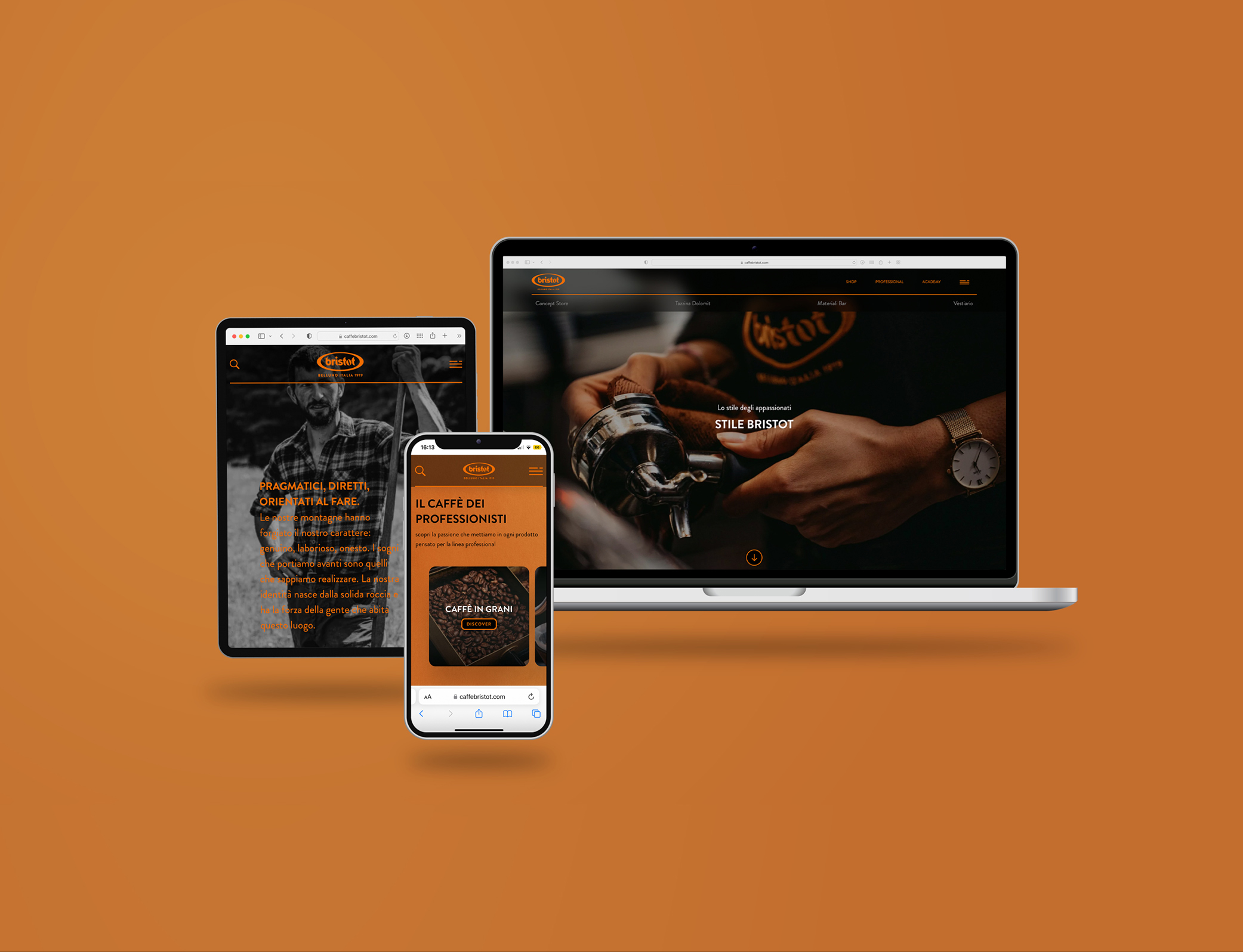
Goal Rebranding the Bristot brand with the aim of repositioning it both in the Horeca and Retail channels and conveying the brand’s distinctive values which are territory, history, attitude, experience.
Concept The identity of a population is obviously affected by the land in which they live. In the case of Bristot, the very nature of the Dolomites environment has forged the pragmatic and passionate character that determines every action, from the desire to search for the best coffee beans all over the world to the way they are packaged up to how their quality is described.
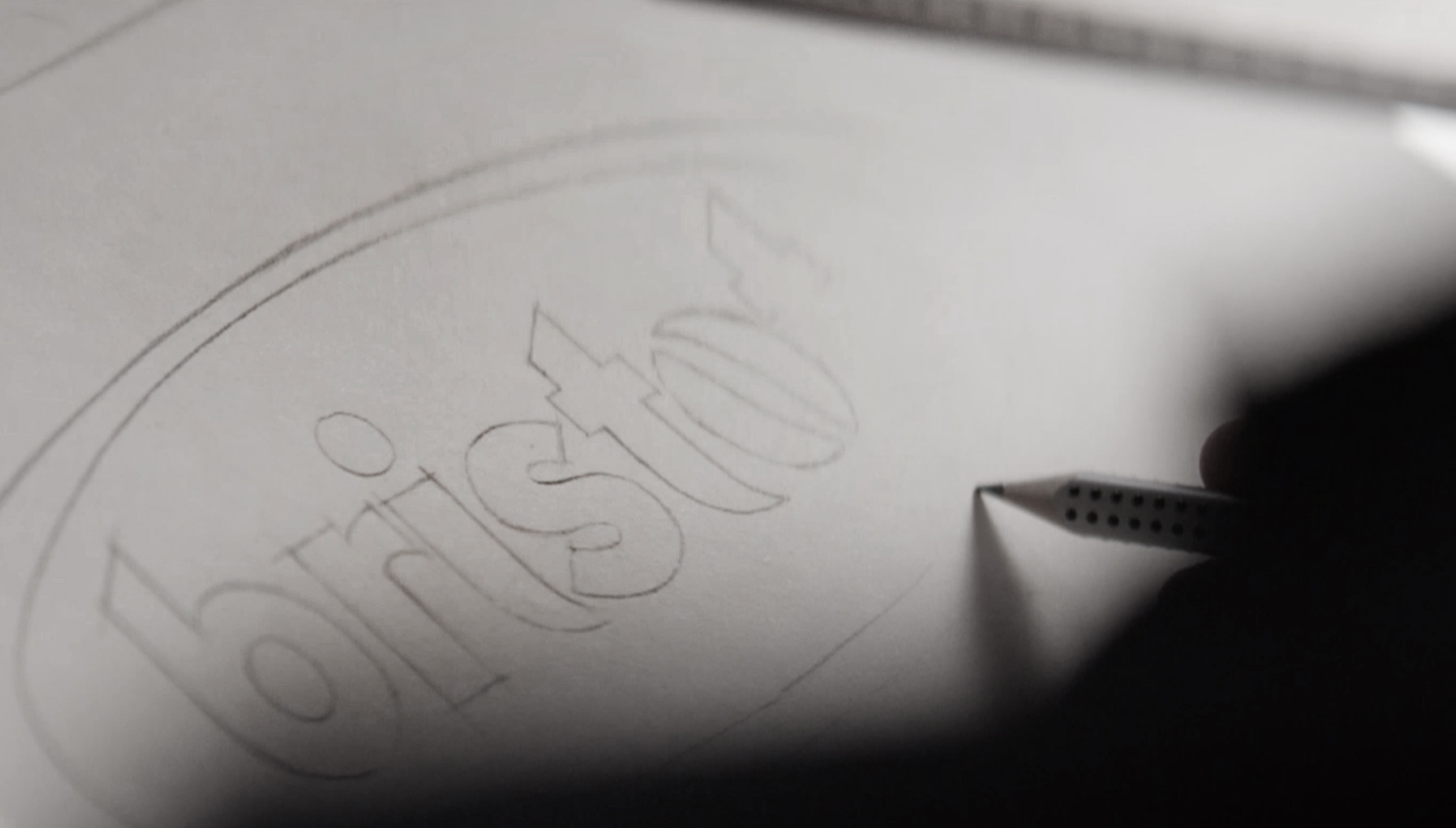
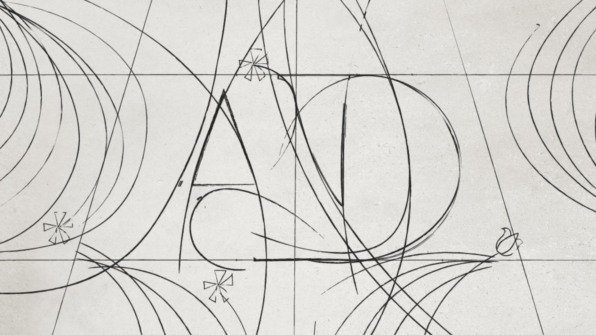
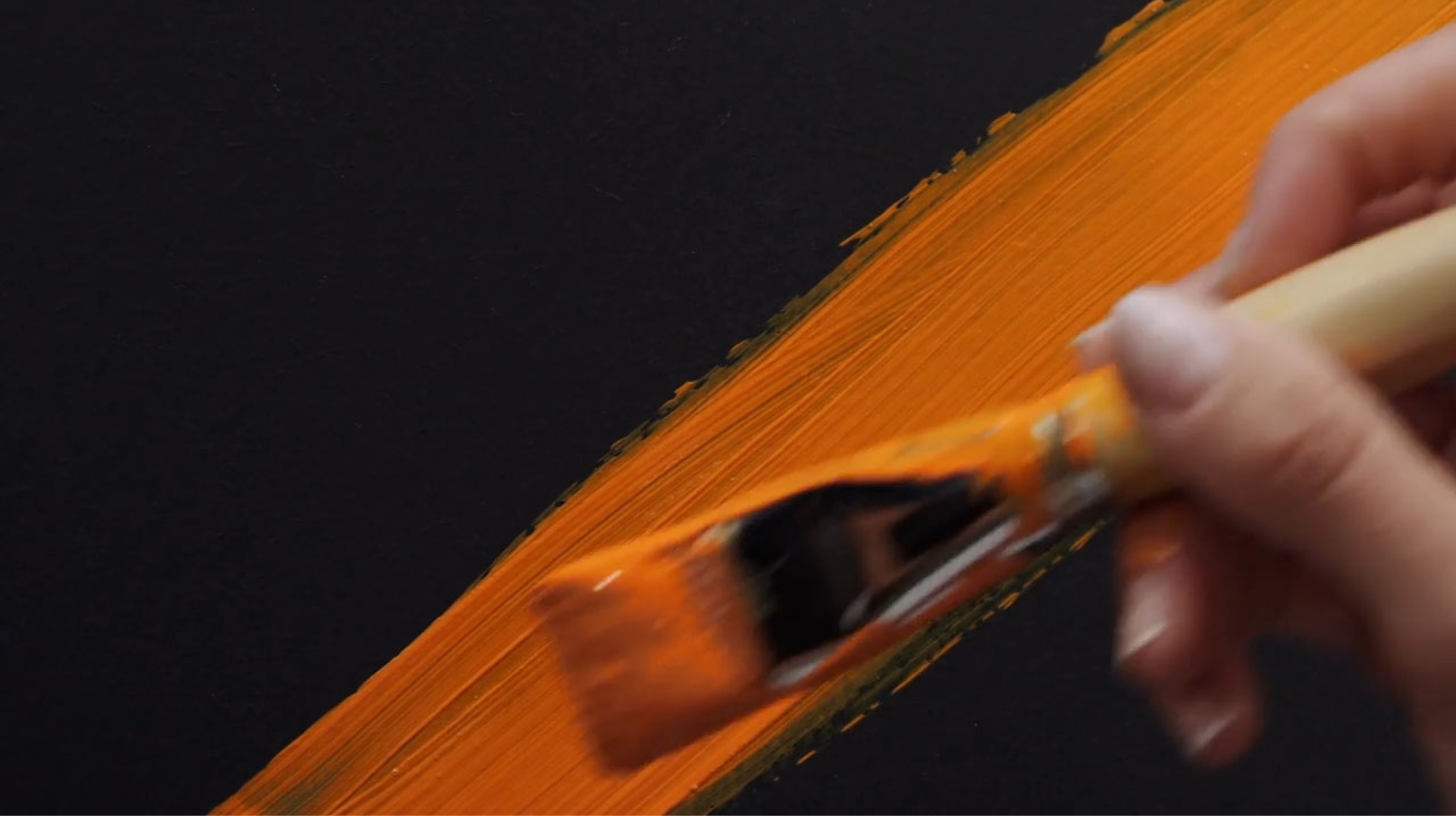
Design The entire new Bristot corporate identity reflects the essential and pragmatic spirit of its DNA. The logotype has been completely redesigned by eliminating the graphic superstructures and giving a new harmony to the literal rhythms of the font. Amber, the new corporate color, returns in all the graphic and physical manifestations of the brand.