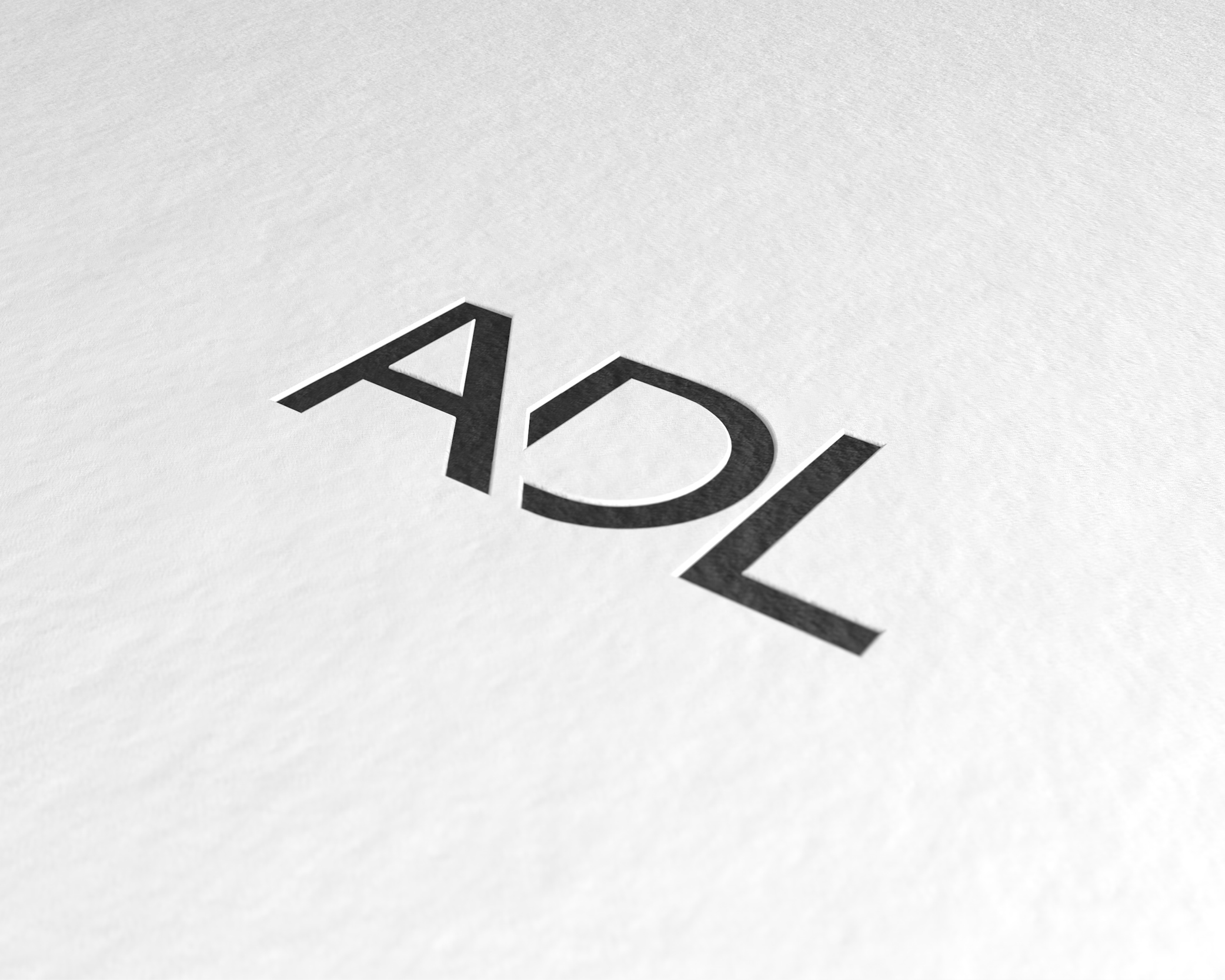
Concept The two logotypes have been aligned horizontally by conceptually connecting them with a linear element that symbolizes their synthesis. The ruby red which, in addition to giving strength and recognition to the graphic element, is also found within the entire corporate identity as a red thread that underlines the nature of the brand identity. The black and white that have always characterized OTTOSTUMM and MOGS interact continuously in a game of positive and negative, allowing you to obtain a fascinating variation of each communication tool.