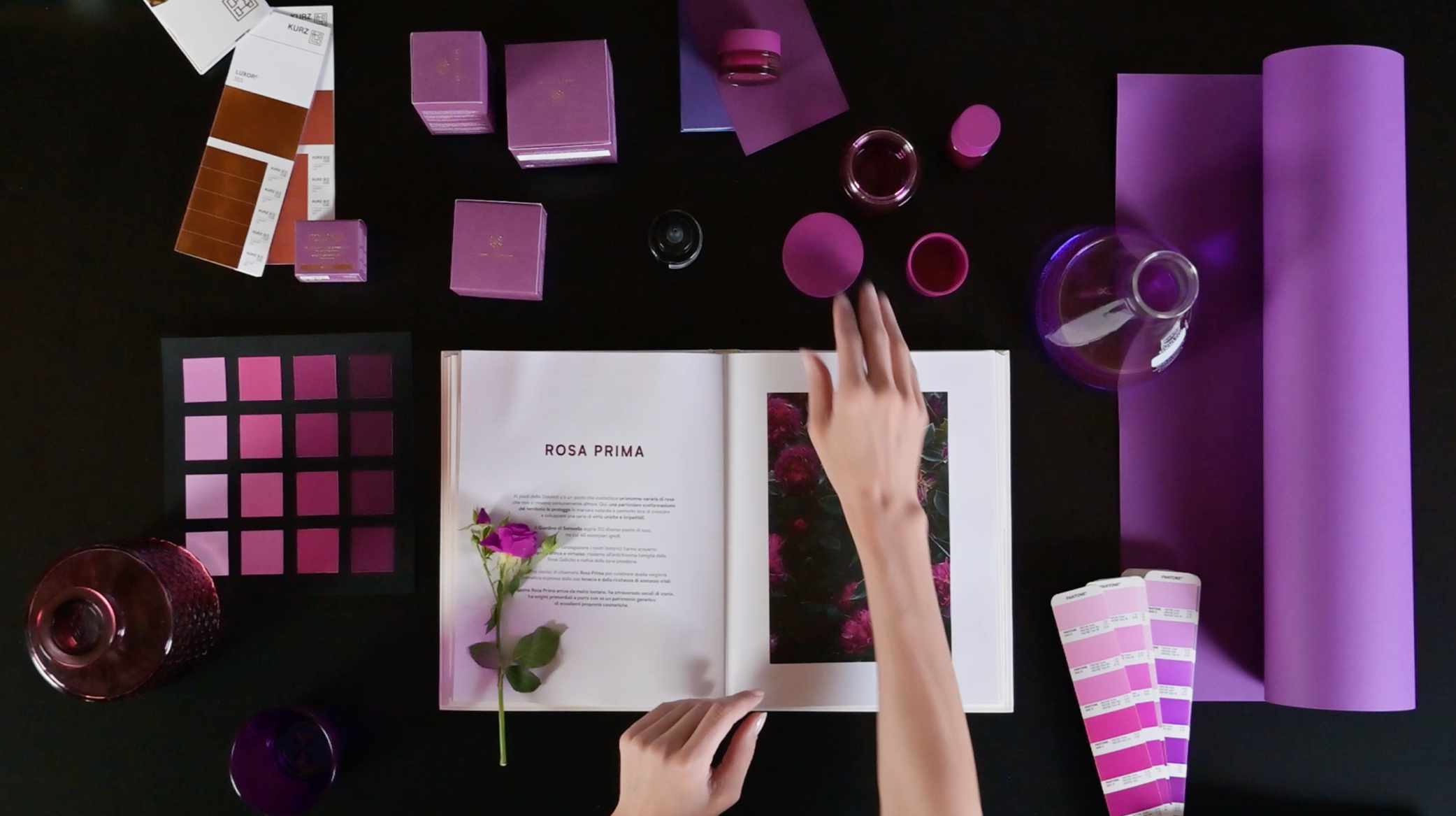
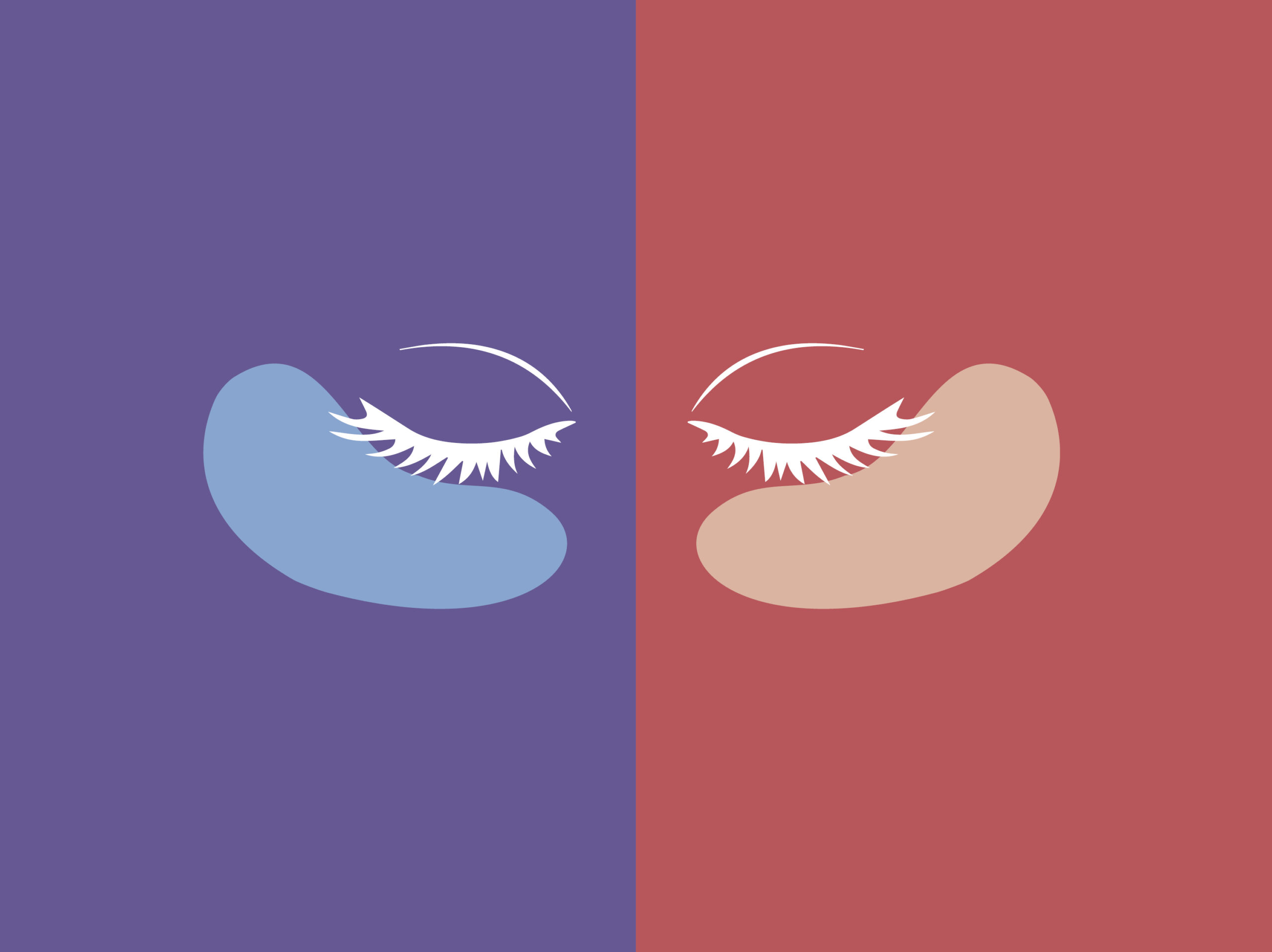
Design The primary and secondary packaging is inspired by the colors of the Prima Rose petals. An intense, rich and refined purple dyes the line’s bottles and cases, contrasting with the brilliance of the rose-gold foil used for the graphics. An aesthetic combination of elegance and expressive power that is coherently re-proposed on all the coordinated materials for the point of sale, such as shoppers, window signs, leaflets, advertisements and digital communication. Everything is tinged with purple!