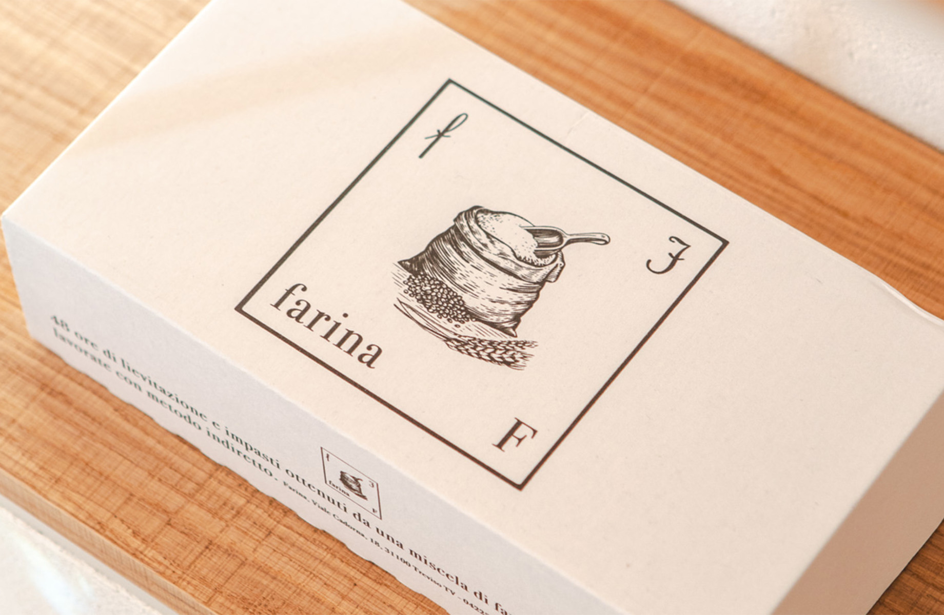
goal Corporate identity redesign to give the brand’s entire visual language a more human character.
concept&design The idea was to redesign both the Starwood symbol and logotype using the imagined effect of a milling tool that rounds every graphic terminal in the same way. The redesign preserves the brand’s iconic graphic style while introducing greater softness and a more human personality. In human morphology and nature in general, sharp edges do not exist; on an unconscious level, we therefore tend to perceive them as alien. To develop the entire corporate identity, a colour palette was defined alongside a selection of materials and finishes capable of conveying the refinement and quality of a brand recognised worldwide.
category: brand identity
client: Starwood
year: 2024