goal Brand identity design for Farina bakery.
concept “All great ideas that have enormous consequences are always simple ideas.” — Leo Tolstoy
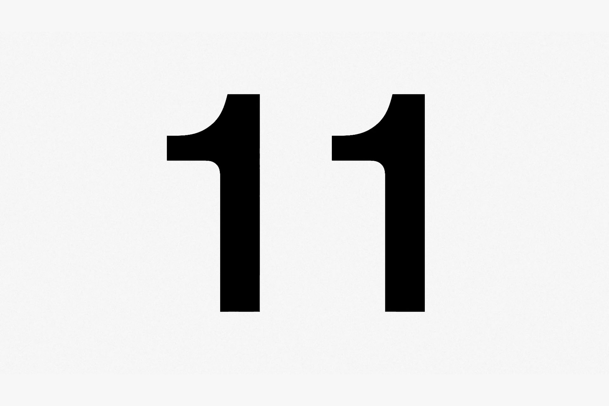
design Simplicity as the essential expression of purity and authenticity. Just as flour is the key ingredient that gives life to baked goods, letters are the building blocks that form words, sentences and, ultimately, stories. In our collective memory, the first place where we discovered the alphabet as children is the *abbecedario*, the traditional alphabet book. This was the inspiration behind the logo for Treviso’s new bakery. The new brand language extends to service materials and packaging, preserving the project’s essential character. It also shapes the bakery and workshop space through its forms, materials and colours. The result is a warm, welcoming environment where quality and tradition come together in freshly baked goods, with every detail reflecting the fundamental idea of simplicity.
category: brand identity
client: Farina
year: 2023