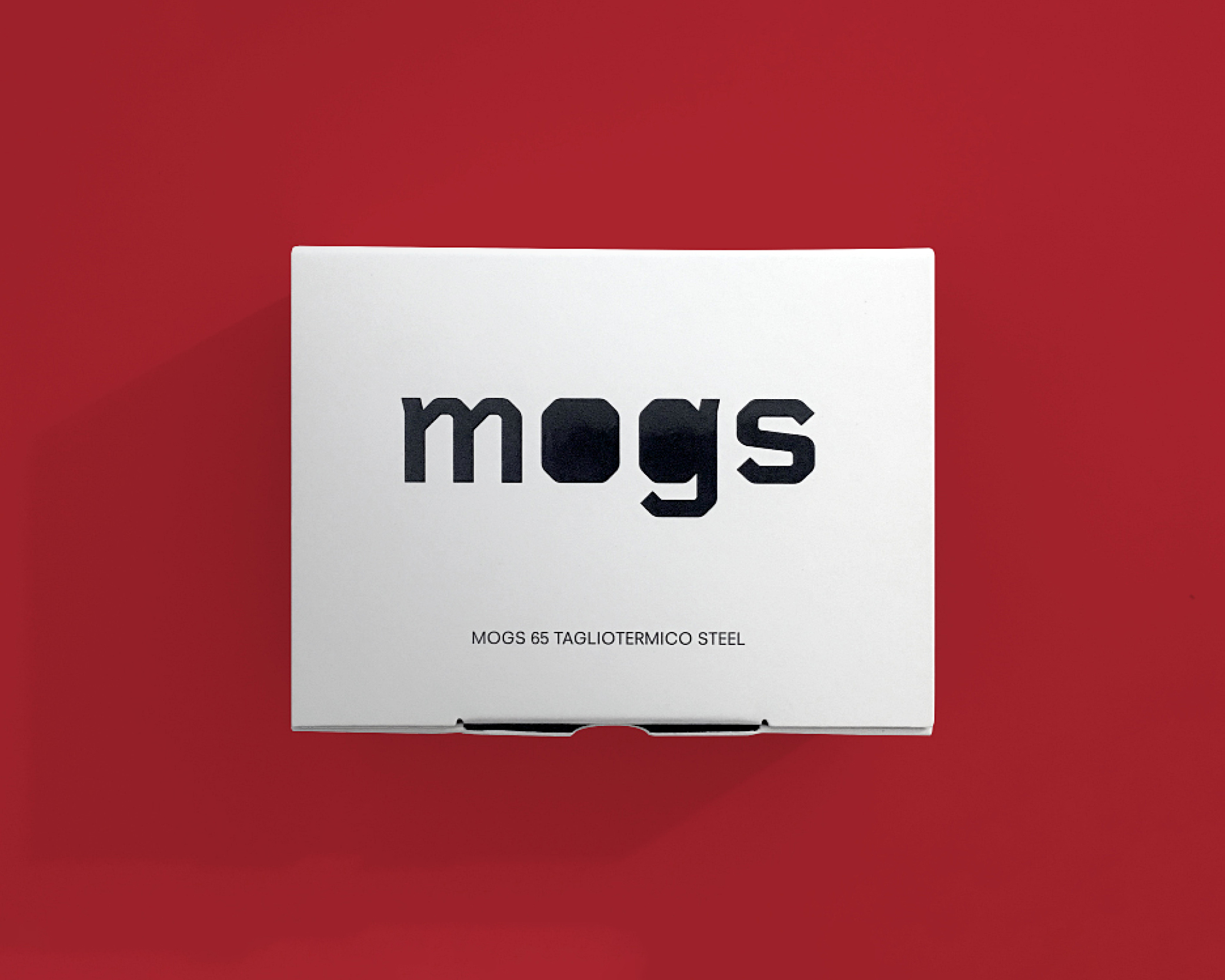
goal Breda packaging restyling to achieve a more contemporary look while highlighting the brand’s heritage.
concept&design A complete restyling that began with the redesign of the logo, simplifying its form, softening its curves and introducing a new tagline that communicates the brand’s Italian identity in a clear, authentic way. Breda’s distinctive bright red and deep blue remain unchanged, but are strengthened by being brought together in a visual system where they never appear disconnected. Colour takes centre stage on the packaging, while the graphics become more essential. The Ho.re.ca line incorporates an illustrative element inspired by one of the most fascinating art movements of the 1920s: Futurism.
category: packaging
client: Caffé Breda
year: 2023