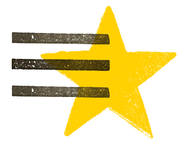
Goal A rebranding of the corporate identity aimed at making the brand’s entire visual language more humanised.
Concept & design The idea is to redesign both the Starwood brand and logo using a hypothetical milling cutter that rounds off all the graphic elements in the same way. The restyling retains the brand’s iconic graphic style whilst giving it greater softness and a more humanised personality, as there are no sharp edges in human morphology or in nature in general – features we therefore subconsciously perceive as alien. For the development of the entire corporate identity, a colour palette was defined, and materials and finishes were selected to convey the sophistication and quality of a brand recognised worldwide.